Updated 2016-04-25
French Knight Chess Set
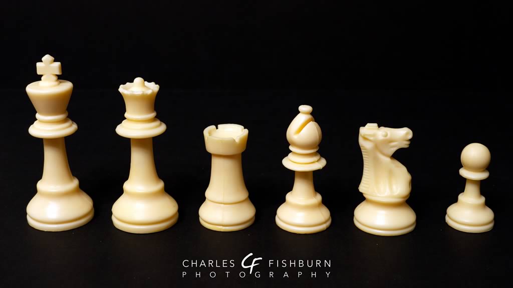
I originally classified this set as a "Lardy" set. But actually, Lardy is a manufactuer's name. Well, it was a manufacturer's name. And they were a French company. Unfortunately, according to the Chess Museum, Lardy probably closed their doors in the late 80s. Read the Chess Museums write-up about Lardy here. I'd have to look back in the archives, but I thought this set was originally sold as a Lardy set – not that it was produced by Lardy but that it was based on the signature Lardy design. At this point, however, you can find sets like this under both the Lardy and the French Knight monikers. The key distinction of this set is the knight with its very upright back, level muzzle, and short block mane at the back at the head.
This type of plastic set is the staple of chess clubs across the country. I participated in the U.S. Chess Federation Junior High Chess Nationals tournament in 1986, which was held in my hometown of Spokane, Washington (believe it or not!). Although I didn't fare so well, the experience really was enjoyable. Each competitor received a set like this and a commemorative vinyl chess board with the tournament logo in the lower right corner of the board.
My particular version of this set is considered to be single-weighted because no additional weight was added to the pieces. So this feels very light and rather cheap, especially when compared to any decent double- or triple-weighted set. But with little difficulty, one can find a triple-weighted version of the set which, I think, makes for a more enjoyable playing experience. The kings are 3.75" tall, which is standard regulation height. The knights, as I mentioned before, are considered to be in the Lardy style.
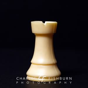
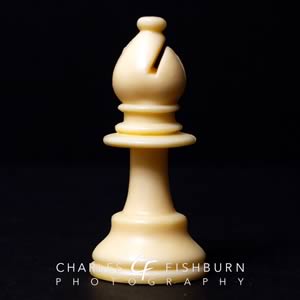
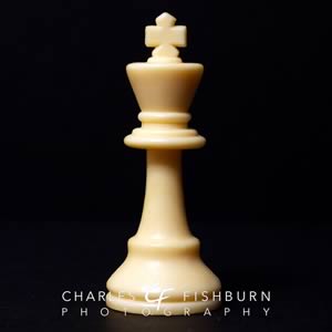
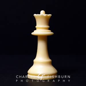
Design-wise, I generally like this set. My least favorite piece here is the knight with its very odd-looking mouth and muzzle. I'll come back to that in a minute. But first: the king. I like it. I like the rather sharp angle of the top edge or rim, and the absolutely flat top surface. Some sets have a bit softer rounding over from the side to the top, and that's certainly fine. But I think this sets a major design cue the queen, rook and knight. I like the cross finial, with its pointed top bar and its strong cross bars. It's probably as large a cross as could fit with this set without seeming too large. But at least it's not so small that it looks out of scale. Along with the level top, you can see the flat bottom of the collar section which is shared by the queen and bishop. Then notice the sweeping concave lines of the sides as they run from the base to the collars, with the arcs continuing through to the tops of the pieces. This is more obvious in the king and queen, but the bishop catches a little bit of that as well. Look next at the lines of the rook: that same concavity runs nearly the entire height of the piece, providing a sharp angle for its top.
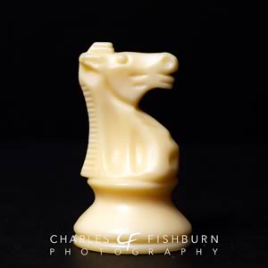
Now back to that peculiar horse: the knight. What I like about it is its very upright posture and level muzzle. The mane has a bit of a concave arc to it that complements the rest of the design, and the relatively flat top goes well, too. I also like the short, snub mane at the top of the head. I like the body of the knight on its pedestal, with the elongated dimples along the side and the smaller ones on the chest. But I just can't quite get myself to like the rather large nostril dimples, and the lines below them. I'm sure the line immediately below the nose is for the mouth. Then the next line must be for a lower lip. And then finally you have the chin. But I don't think it's terribly attractive. And overall, it seems like the muzzle should be just a bit longer. Something about the arcing line from the chin to the next feels truncated. I'd rather see it with a slightly longer muzzle and more detailed mouth like the knight from the Collector set.
All that said, I think, unfortunately, you will fairly hard-pressed to find a set exactly like this. In some versions of this set – some old and almost all new – I have seem some design differences that I don't like. The king tends to remain relatively unchanged. But on the queen, the small ball finial atop her crown is very often left off, leaving her with a rather dull and very flat top, despite the points of the crown. What I think is actually more a disservice to this design appears in the newer rooks which lack the concave sides and flared parapets but instead are plumb straight in all regards. You can find that kind of thing in several other sets, so why not keep the flare here? My guess is that was most likely a decision based on economics rather than aesthetics. The bishops tend to be unaltered. And the knights, in their awkwardness, also tend to be unaltered.
Unfortunately, some retailers seem to be confused with regards to this style. I have seen sets whose knights are very distinctly "German" looking (see my German Knight set or my Kasparov Signature set), but still labeled "French". Equally bad, I've seen a few sets in which the only difference between them is the knight itself; all other pieces were identical. While I tend to think that the knight is perhaps the most defining piece of any given set, I don't think that negates the significance of the other pieces from a design perspective. Of all the versions of this that I've seen for sale acros the web, the French Lardy chess pieces by House of Staunton is probably the closest I've seen my plastic set from the 1980s as far as hitting all design cues.

